Understanding The Problem
Where you work is not as important as what you are working on. Invest in those community spaces which support the overall experince of the workingspace. How do we approach this?
Discovering New Conclusions
In order to better understand the needs and pain points of people, we developed a series of questions and began our research.
- Who are the users? Do they know what hybrid work is, and what the benefits are? What are the current market trends? Market insights helped us here.
- What are the available apps out there? What apps do people like or dislike? We did a competitive analysis, to understand the problem space.
- What are their current pain points? We conducted User interviews to help us to validate our hypothesis based on market research.
- We analyzed Customer comments in several apps to get a better understanding of what are other pain points in current apps.
- How does a solution feel? Rapid Prototyping helped us understand if we were going in the right direction.
UI Inputs
Output: min. 2 high-fidelity screens shown in a separate tab in the app (same hierarchy-level as ‘discovery’ / ‘office’ / ‘bookings’ / ‘profile’)
User: office worker, who goes to the same office every day
Content requirements
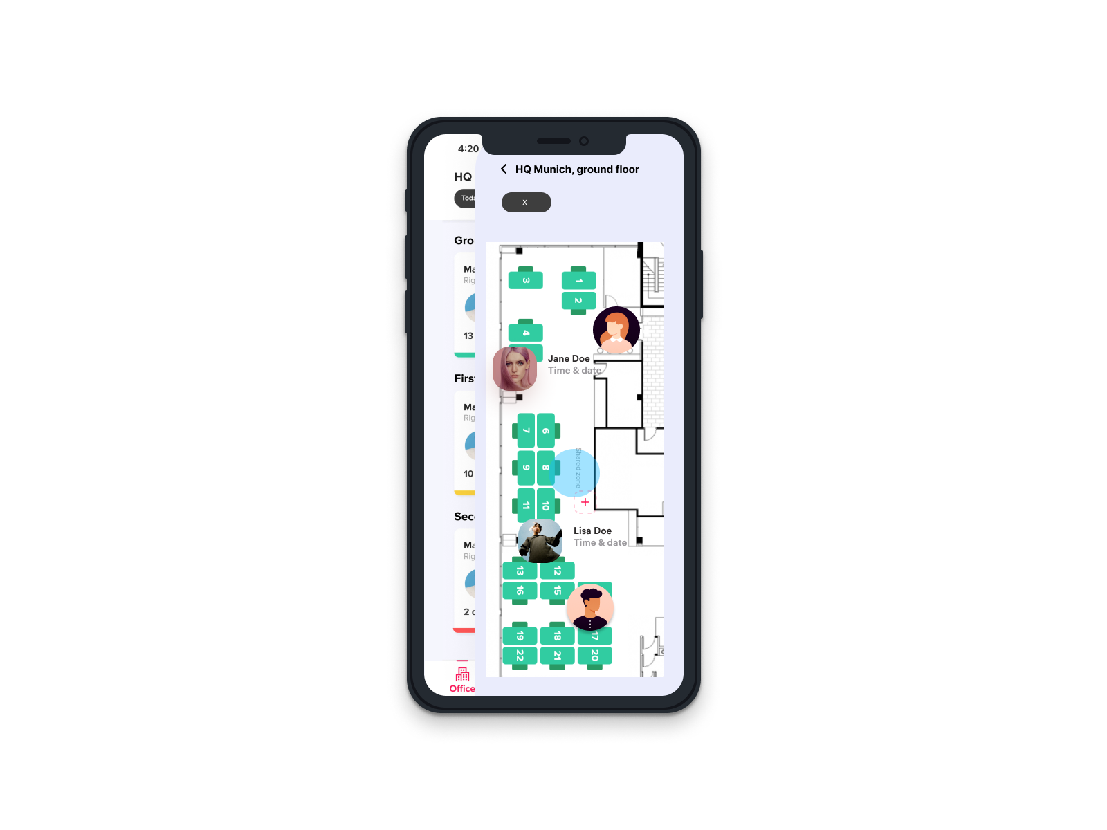
Screen 1 / overview (main screen when tapping on the feature):
-
-
- The user should be able to distinguish between people who are in The office and such who are not
- The user should be able to check in advance (e.g. 2 weeks ahead) who will be in the office
- The user should be able to search for a particular person through a searchbar or similar
- The screen should be visual / avatars be shown / be engaging
-
Screen 2 / details (when tapping on a person in the previous screen)
-
-
- The user should see further details about a person, such as full name, job title, team, booking details
- Add any other, if you think they are necessary
-
Visual requirements
High-fidelity, best to assume an iPhone11 Pro / X size – as much as possible. Design principles such as consistency, visual hierarchy, discoverability of affordances etc.
Compatibility
iOS 13.0 or later. Compatible with iPhone, iPad & iPod touch.
Figma, interactive prototype
shorturl.at/csGY5
Design descisions
Side drawer
Side drawer helps optimize space when you have lots of navigation options to present to the user. It is a great navigation pattern in mobile app and tablet (small-screen) UI design because your app should be intuitive and predictable.
But making navigation discoverable and accessible is a challenge on mobile due to the limitations of the small screen and to the need of prioritizing the content over the UI elements. Different navigation patterns attempt to solve this challenge in different ways, but they all suffer from a variety of usability problems.
Remove UI noise for intuitive navigation flow
If the mobile app has a deep navigation structure, the user will need a way to move between navigation destinations without being distracted by visual clutter or complicated navigation paths.
The side drawer groups all navigation items under one root view. By consolidating items, rather than dispersing them across the UI, you’ll increase visibility. You’ll also reduce the cognitive load for the user as they’ll only need to focus on a single UI component.
Additionally, with no back button, the number of required user actions to complete a task is kept to a minimum.
Create hidden navigation for secondary actions
The side drawer allows you to save on valuable screen real estate by neatly storing secondary navigation links, such as user profiles, or settings or contact pages.
Side drawers and slide menus are often used to house less important navigation links, which the user isn’t likely to use on a regular basis. They allow you to keep your most important features and navigation destinations front and center and de-emphasize the rest.
Tab bar fairly easy communicates the current location. Properly used visual cues (icons, labels and colors) makes self-evident so doesn’t require any explanation.
Make touch targets big enough. Make targets big enough to be easily tapped or clicked. To calculate the width of each bottom navigation action, divide the width of the view by the number of actions. Alternatively, make all bottom navigation actions the width of the largest action.
Make sure they are placed inside of the frame, and not simply put on top. Check your layers structure, they should belong to the main frame you are viewing.
Similar to the earlier idea, this one aims to implement the timeline concept vertically, thereby making it easier to select dates and also visually appealing.
Design overview


Check in
Track voluntarily when, where and how you work
Workspace
Overview of the office space you are currently signed into
Understand office demand of employees
Measure office utilization and identify patterns to define your optimal office setup. Ask employees for ways to improve your workplace.
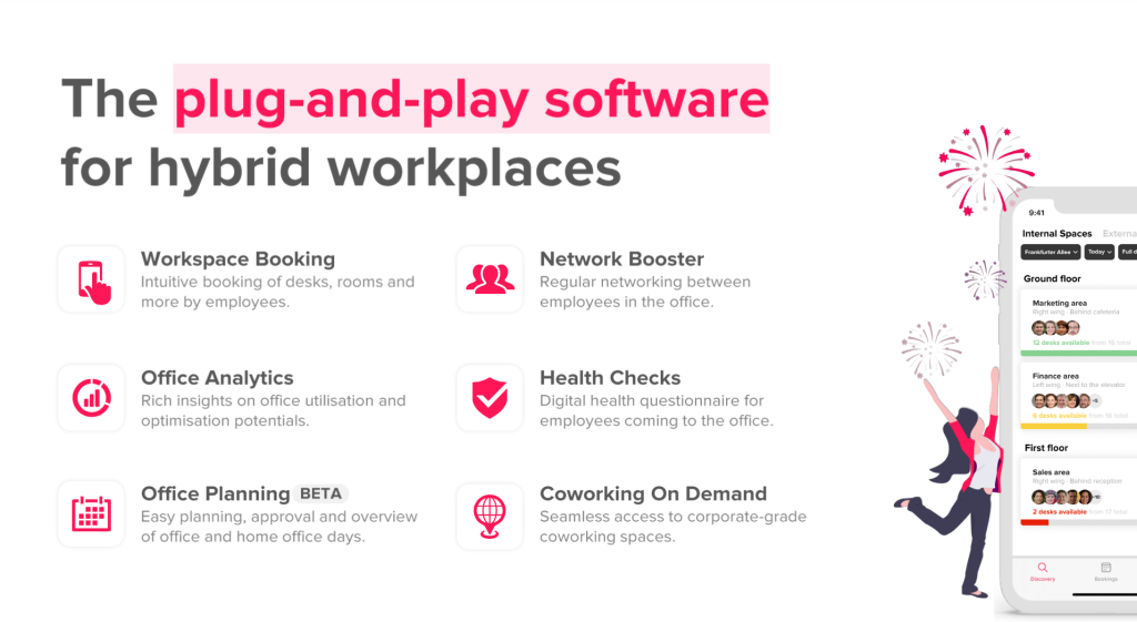
 Plug-and-play solution
People-centric user experience
Simple employee onborading (SSO)
Simple & flexible office setup
Office capacity limits & access restrictions
Analytics on office occupancy
Smart desk booking for an organization
Let your employees see when their colleagues go to the office, discover available desks on interactive floor plans and book in just two clicks.
Booking of desks in advance or on the spot
Simple integration of floor plans
Multiple resource types (e.g. meeting rooms, parking spots)


Tailored to your hybrid office setup
Define areas with free seating or with access restrictions, and switch on a check-in system to avoid no-shows.
Different types of access restrictions
Check-in systems to avoid no-shows
Covid-19 screening tool available