
The idea is that a user has linked their mobile phone with their bank account and this way there is no need to know any bank details of the recipient. A successful transfer makes the money available directly in the recipient’s bank account ready for use.
Goal
To create an easy-to-use interface providing a clear and concise overview from the sender’s perspective of related views on how much money is sent, a confirmation of the transfer and an acknowledgement of when the transfer has been successful.

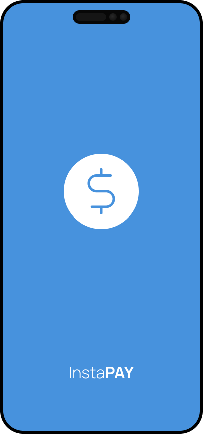
1.I created 2 versions of a startscreen
Clear icon, not too much fuss
Currency dollar icon – everybody knows a dollar sign (assumption)
even though this was not part of the assignment, I included it for an overall concept entrance
2. Standard iphone Touch ID screen for mobile layout
Touch input is a great way to help users perform actions/accomplish tasks (when time is in minus)
And you dont want an eccessive login process
3. First screen the users sees is “home” (but since that is not part of the task) we jump straight to second icon in bottom navigation when =
<“send” is selected, user is able to make an new transfer by clicking the only CTA button on screen
There is also a 3rd icon for help/customer support
4. When CTA (+NEW) button is selected user is presented a slide-in overlay
the overlay function is: displays light boxes that appears on top of main content in the app==> with a ==>
search filter/bar (lup icon) component:
-included so the user can search either by contact name or phone number
=> input field empty state with search suggestions (contact or number)
5. when contact or phone number is selected – user is presented with a simple screen with 3 buttons:
SEND (Primary CTA)
CANDEL (secondary CTA)
Once button is selected user is directed to “amount input stage/screen”
the input stage nudges/indicates that the user must enter amount in order to proceed = inactive CTA button (send)
6. amount
action send
5 DKK DKKV
Input field filled state activates option CTA “SEND” button ==> when pressed user is presented with a “transfer review” overlay
User can either CANCEL or CORNFIRM
Once confirmed user recieves a slide down recepit (the sliding motion is a great replica of a physical receipt that comes out of a machine)
V check icon (could also be a micro animation)